Fintech product + AI safety2026
Aperture Financial Intelligence
Portfolio-aware research, risk, and goal intelligence
View case study
A content-rich website for American students exploring education in Europe, designed to build trust and make a complex decision easier to navigate.
Date
2021
Category
Editorial web experience
Key skills
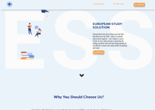
European Study Solution helps American students apply to European universities and prepare for life abroad. The service combines program guidance, application support, document preparation, and practical information for the move.
ESS needed an informative website that could build trust and help students understand the available programs, application process, deadlines, fees, and practical realities of living abroad.
The objective was to create ESS's main information platform from scratch, with clear paths to services, pricing, and partner universities in France.
We conducted research to understand the students' environment, expectations, behaviors, and concerns.
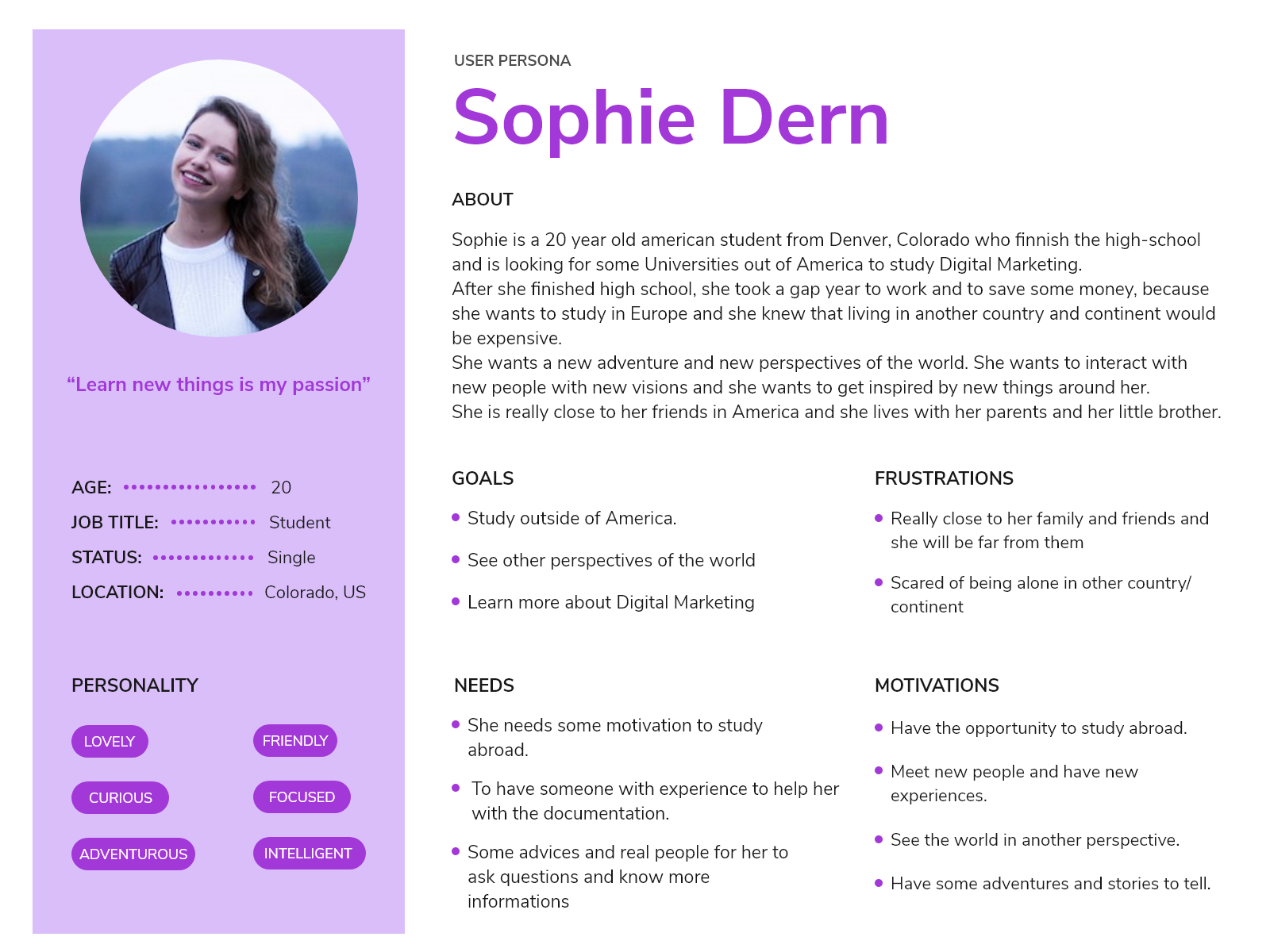
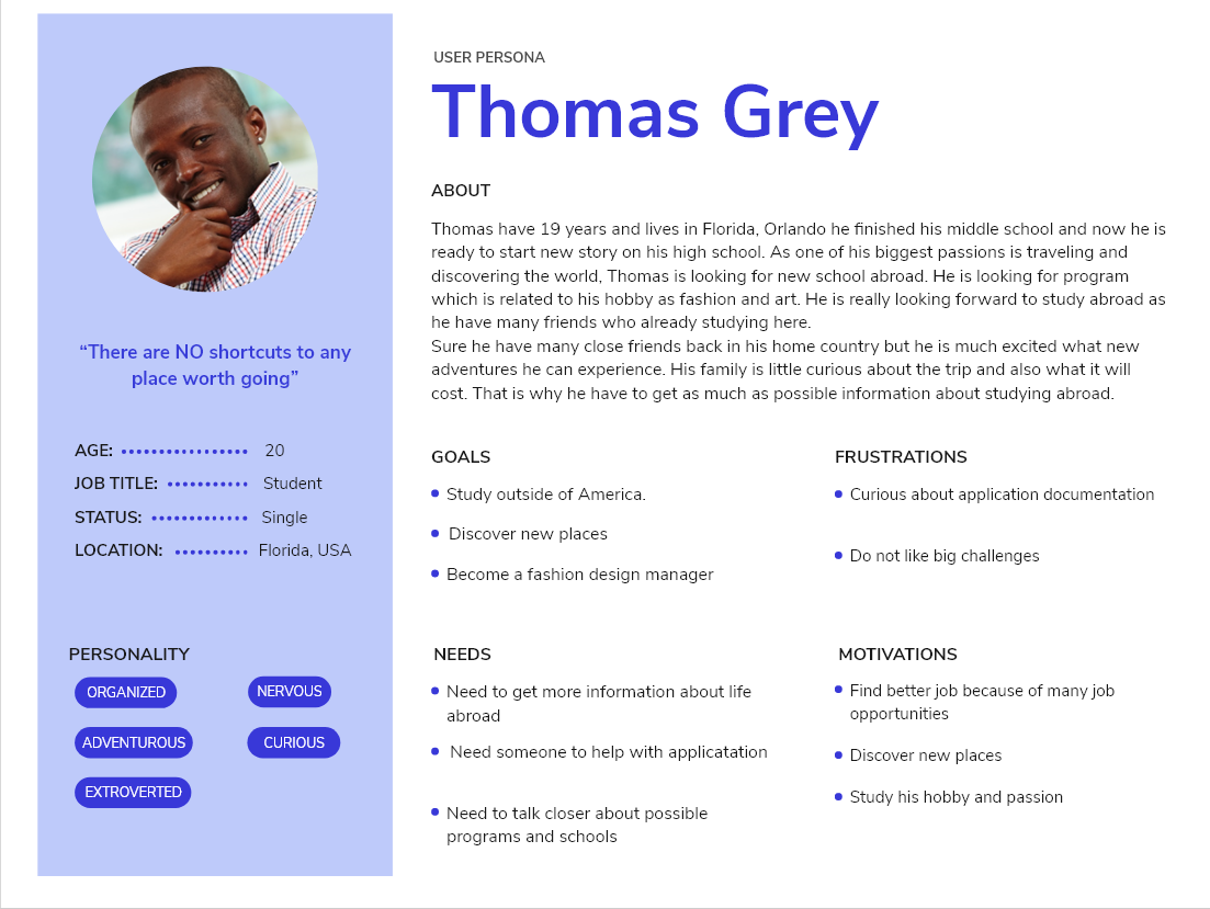
An interview guide helped us focus on American students aged 18 and older who were open to studying abroad and experiencing a new culture.
Personas made the students' needs, behaviors, and goals easier to evaluate throughout the design process.
We used the Five Planes Method to move from product strategy into interface decisions.
We began with two questions: what value should the website create for the organization, and what value should it create for students? Because ESS did not yet have a website, the platform needed to attract potential customers and connect students with partner universities.
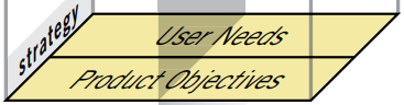
The answers pointed toward a content-led website. That made information architecture and readability especially important.
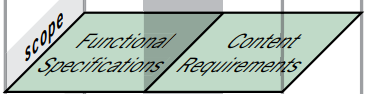
We defined the content and functional requirements needed to support the students' decisions.
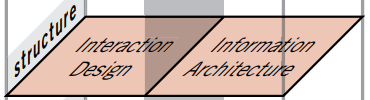
Client feedback helped us refine the information architecture, categories, and navigation paths.
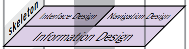
The information architecture was designed to help students find relevant content with as little effort as possible.
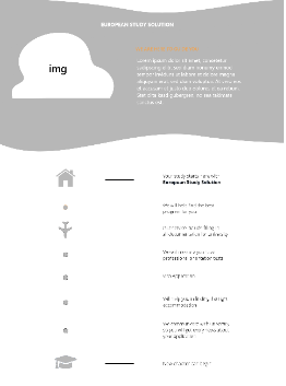
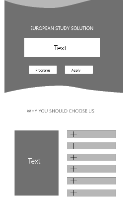
During the skeleton phase, wireframes clarified the page structure while keeping styling, color, and graphics to a minimum.
We established the navigation bar where we included different page labels to emphasize the structure.

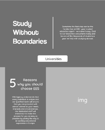
For the opening section, we explored a full-width image and slideshow treatment.
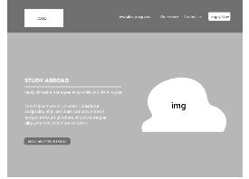
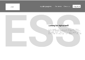
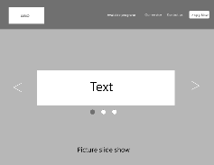
We tested several landing-page directions to explain ESS quickly and make the key services visible from the start.
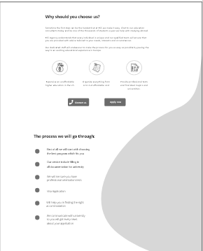
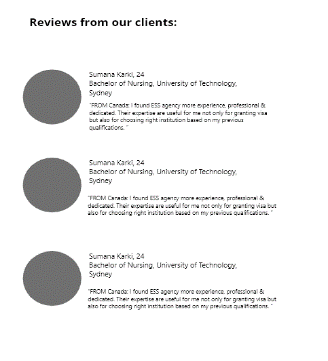
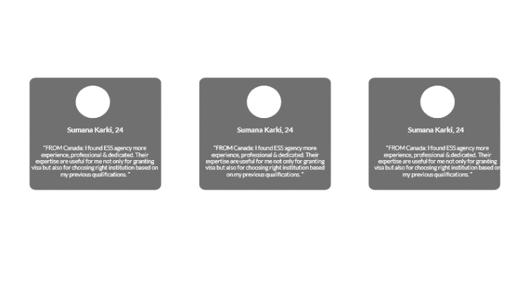
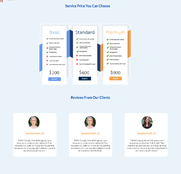
A card-based review section was introduced to build trust and group testimonials clearly.
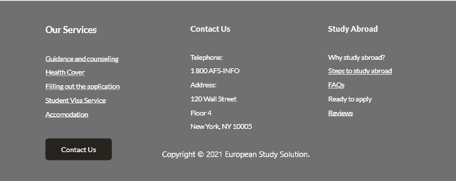
The footer repeats the most important links and the agency's contact information.
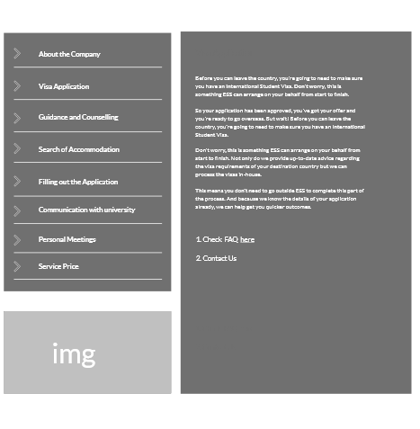
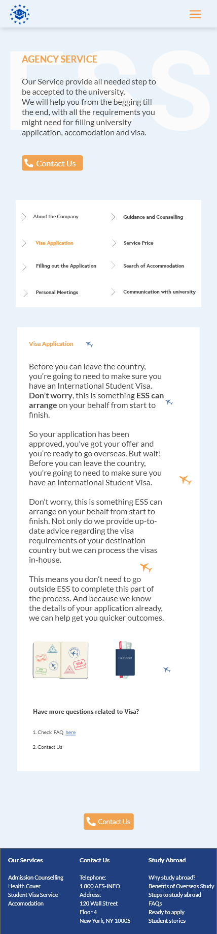
The service page uses a vertical sidebar with tabs and a flexible content area for the selected information.
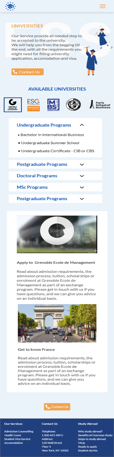
The university page balances visuals with readable content in a reusable template that can support multiple institutions.
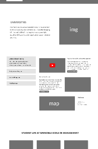
After additional client feedback, we featured partner universities on the landing page and added an institution switcher to the university page.
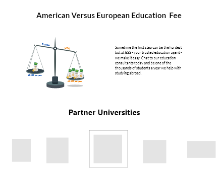
A price comparison highlighted the financial advantages of studying at European universities.
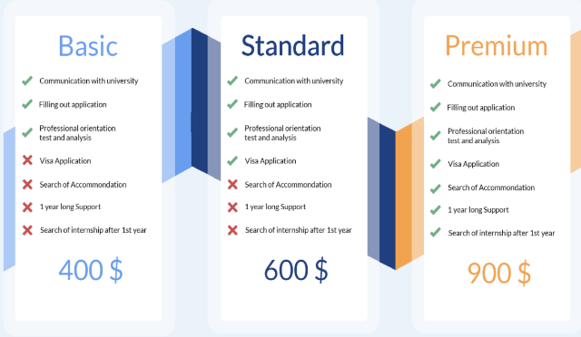
Service packages made the pricing and included support easier to compare.
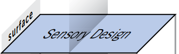
At the surface plane, we brought the structure, content, functionality, and visual direction together.
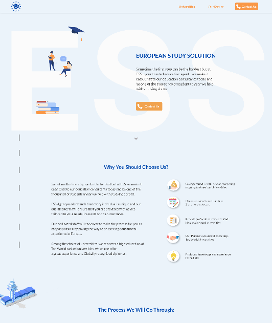
The final iteration combined our ideas, client feedback, research, and the necessary design components.
The review section includes space for three testimonials and can expand into a carousel later.
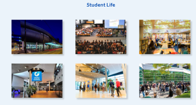
Images of the schools break up dense content and help students imagine the experience more clearly.
The contact page confirms successful submission so students are not left wondering whether their message was received.
Responsive design was essential for the target audience, so we created tablet and mobile prototypes with a compact navigation pattern.

After the high-fidelity mockup, we implemented the website with HTML, CSS, and JavaScript.
We used five-second and think-aloud tests to evaluate first impressions and check whether the website supported the intended tasks.
The results supported the direction and helped validate the concept.
We added metadata and search-focused optimization so the website could be indexed and presented more effectively in search results.

The final website gives ESS a central platform for presenting its services and staying in contact with prospective students.
For students, it creates a clearer path to the information and support they need when considering education abroad.
Portfolio-aware research, risk, and goal intelligence
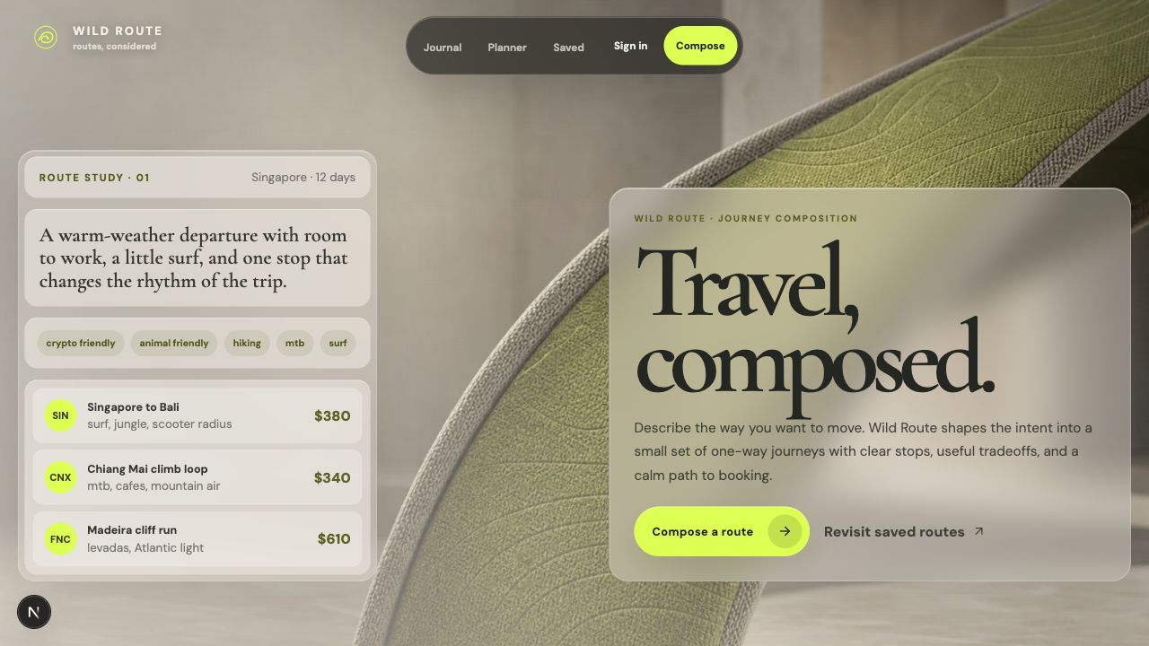
Prompt-first route planning for adventure travelers
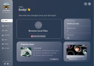
Copyright protection SaaS
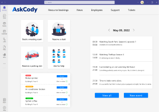
Hybrid office management in Microsoft Teams