Fintech product + AI safety2026
Aperture Financial Intelligence
Portfolio-aware research, risk, and goal intelligence
View case study
A dashboard concept for automated copyright monitoring that helps creators review ownership signals through a clear workflow.
Date
2021
Category
Product UX + frontend
Key skills
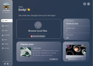
CatchScan helps content creators protect their work through automated copyright monitoring. Creators upload images to a web application, and the platform scans for potential unauthorized use.
Our task was to redesign the dashboard and improve the product architecture around CatchScan's existing matching algorithm.
The beta product proved the core functionality, but the dashboard had fragmented user flows and an unclear hierarchy. The experience did not yet reflect the value of the service.
The goal was to create a clear dashboard around the copyright-matching algorithm. We focused on information architecture, navigation, and task flows so creators could upload work, monitor results, and understand their options.
We used a design-thinking process to keep the work grounded in creators' needs and revisit assumptions as we learned more.
The process moved through empathize, define, ideate, prototype, and test, with iteration between stages when the evidence called for it.
We started by identifying the creators most likely to use the product and understanding their needs, expectations, and concerns.
Benchmarking helped us compare competing solutions and identify the strengths, gaps, and distinctive aspects of the CatchScan concept.
Before the interviews, we grouped potential users to define the audience for the web application.
We combined behavioral and psychographic criteria with demographic and geographic factors.
The research pointed toward English-speaking content creators aged 18 to 35 as the primary audience.
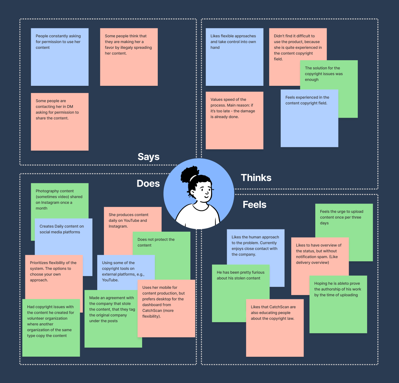
We organized interview findings in an empathy map.
This helped us understand the users more clearly and prioritize their needs.
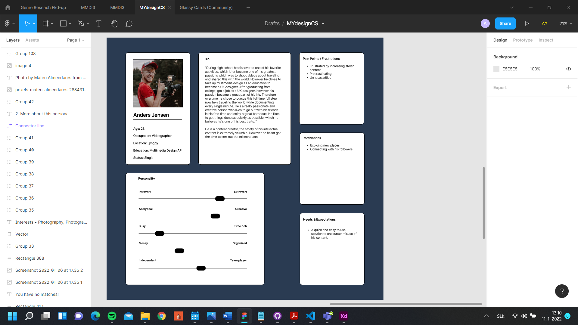
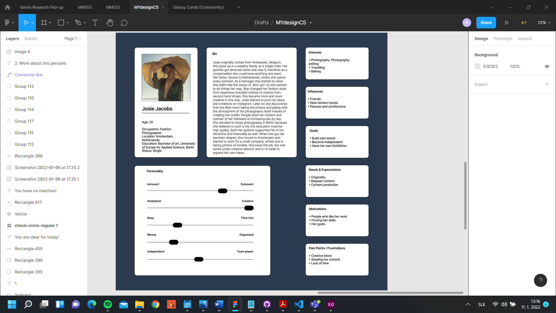
We created two personas to make those needs tangible and identify which parts of the experience deserved the most attention.
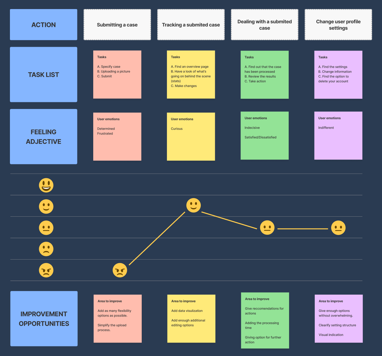
A user journey mapped the process from submitting a case onward, including opportunities to improve clarity and reduce frustration.
We reframed the challenge from the users' point of view.
We condensed the findings into clear, one-sentence problem statements.
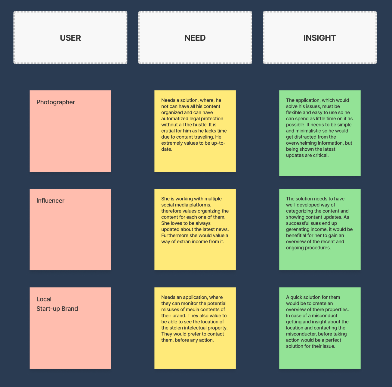
We turned those statements into questions that could guide ideation.
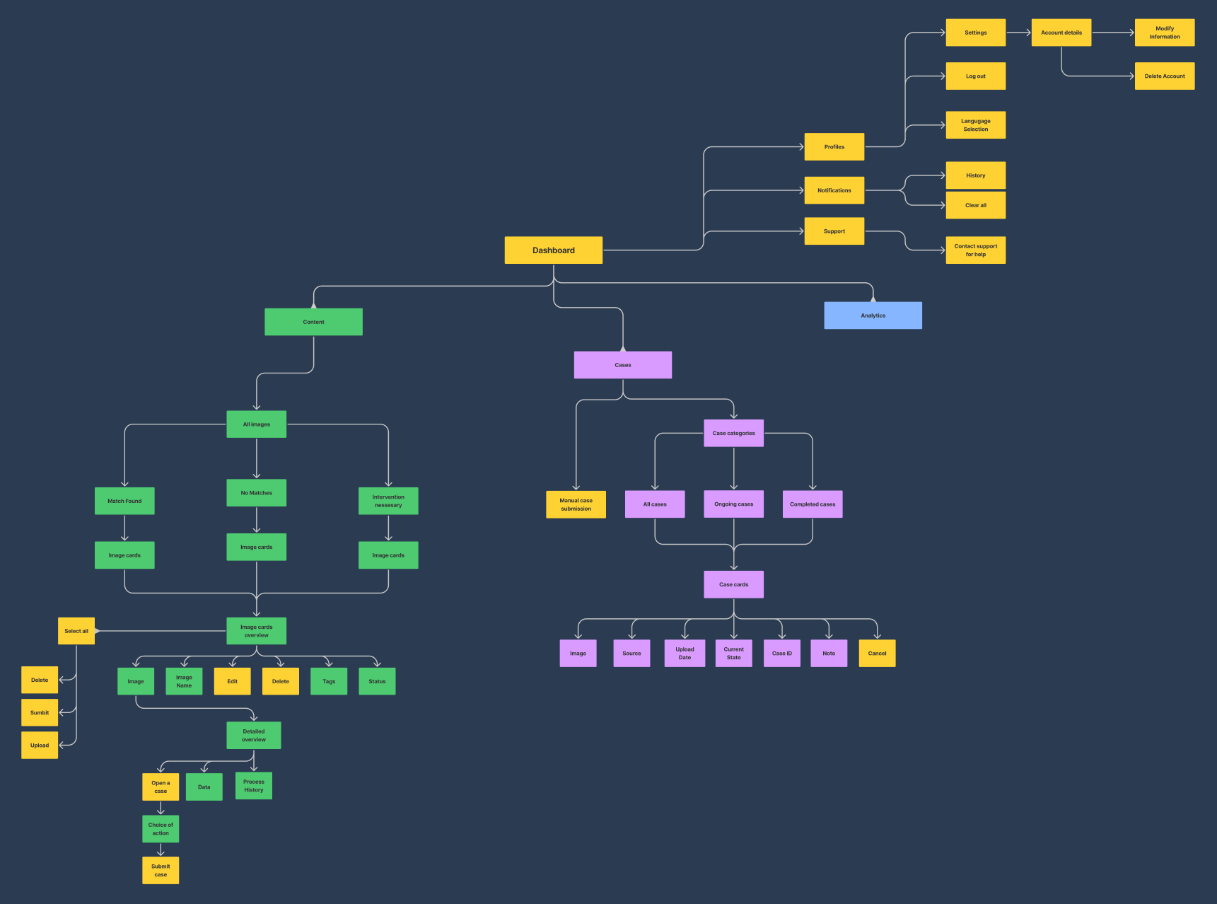
A content inventory helped define the scope and ensure the necessary product elements were covered.
With the user needs defined, we moved into ideation.
Brainstorming translated the research findings and problem statements into possible product directions.
We chose a dashboard structure because it could support the required tools while keeping the main actions visible.
We used restrained glassmorphism to separate important objects and create hierarchy.
The information architecture was designed to minimize effort: clear grouping, readable typography, and direct access to the tasks creators needed most.
We started with sketches to capture the initial direction.
Low-fidelity wireframes made the layout and key interface elements more precise.
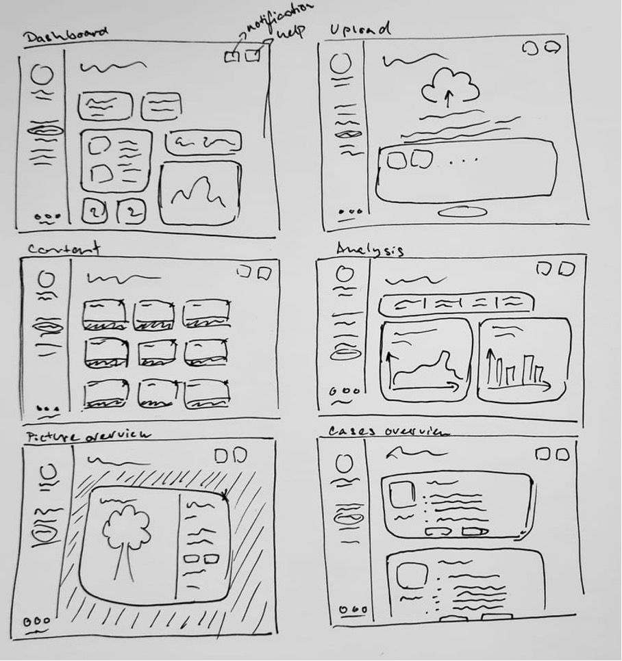
The research supported a desktop-first approach because the product needed to present several professional tools in a single workspace.
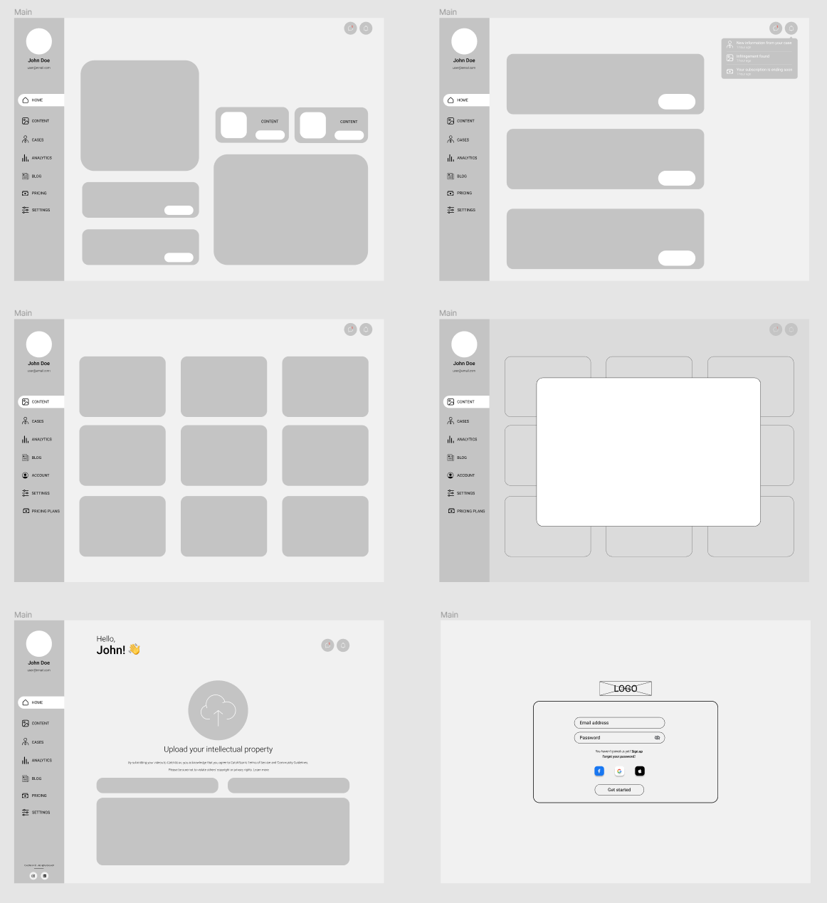
The wireframes then developed into high-fidelity mockups.
We used Atomic Design to organize the interface and support collaboration.
The system started with atoms: the smallest reusable interface elements.
Combining atoms produced molecules such as navigation buttons and content cards.
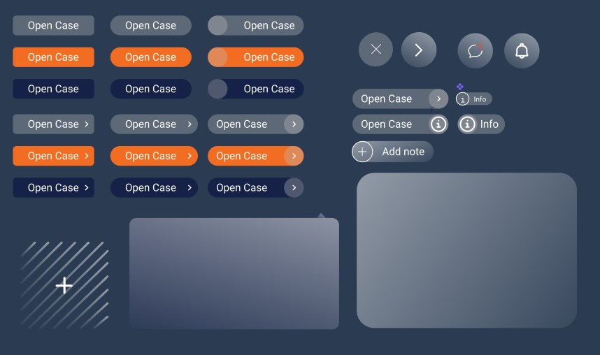
Those elements formed larger organisms such as navigation areas and content libraries.
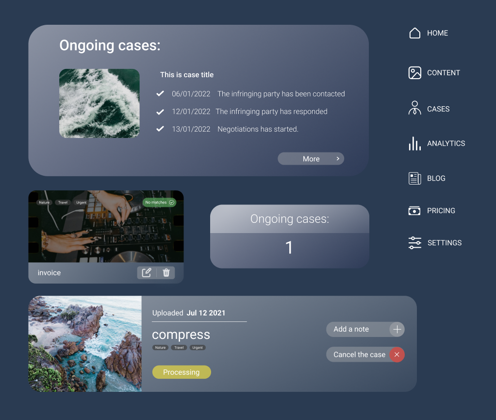
Templates established the page-level structure.
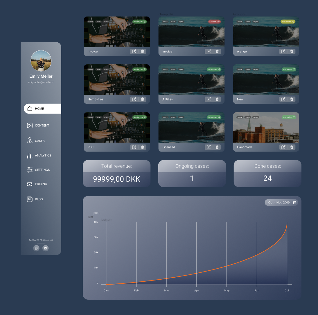
The final pages combined those templates with real content.
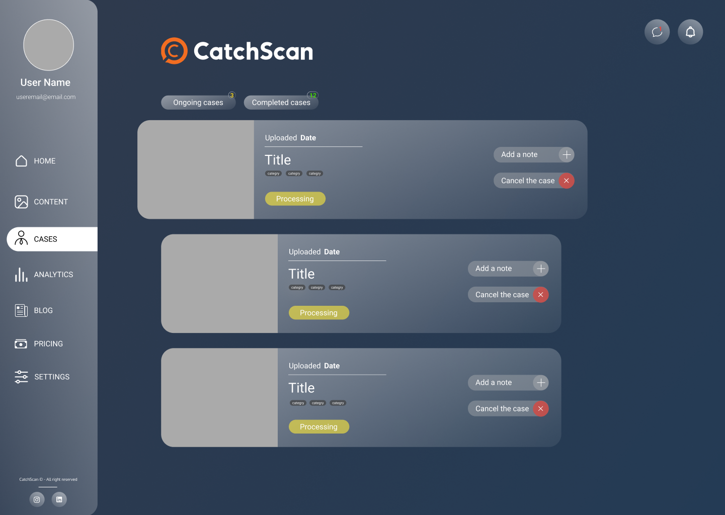
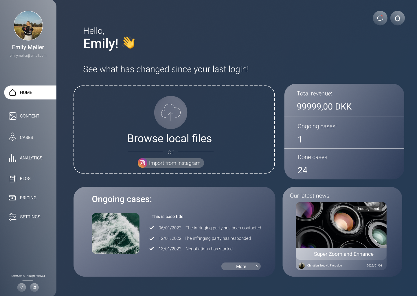
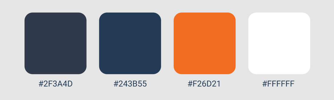
Color shapes the first impression and helps users read the interface. We kept CatchScan's existing blue and orange palette to connect the dashboard with the brand.
Maintaining consistency with the marketing website made the product feel more coherent.
Several iterations helped us simplify the visual direction and find a more balanced solution.
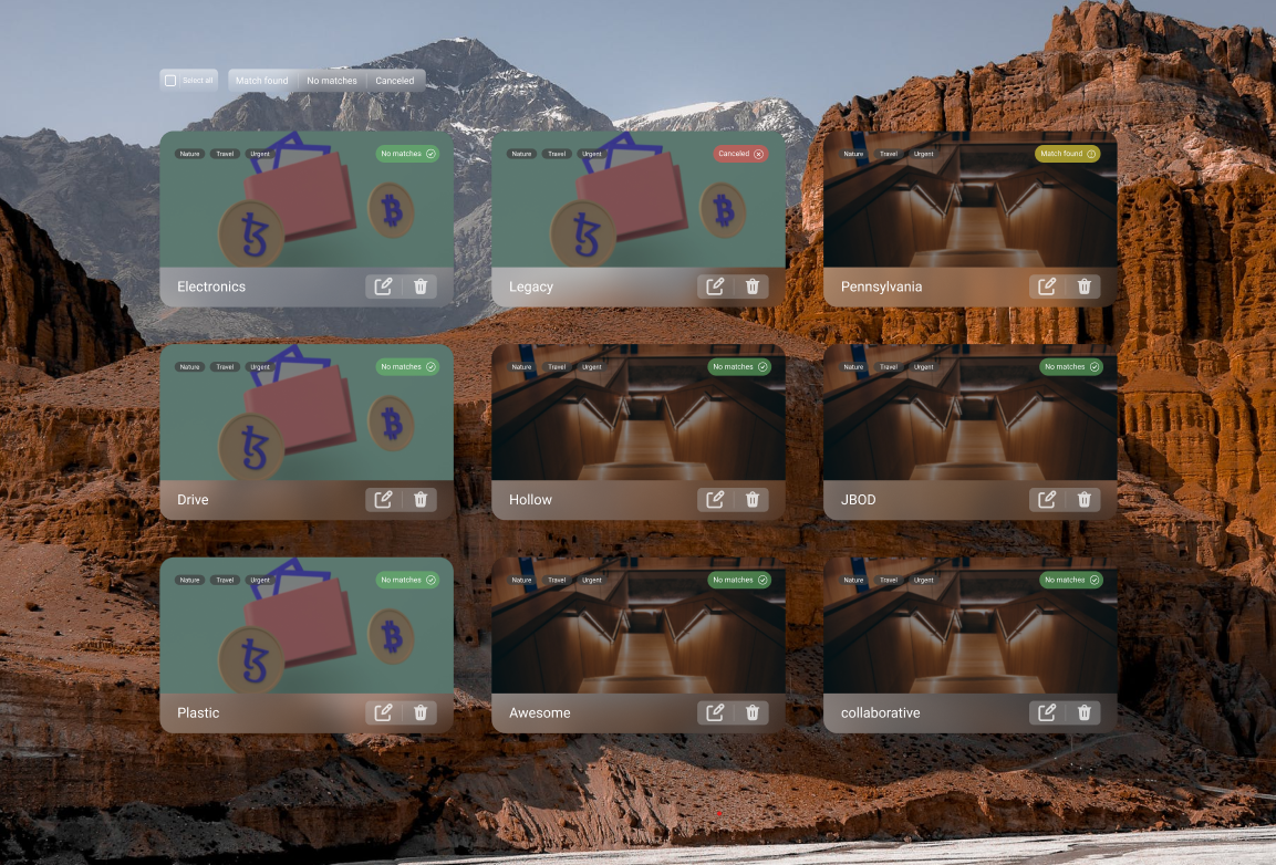
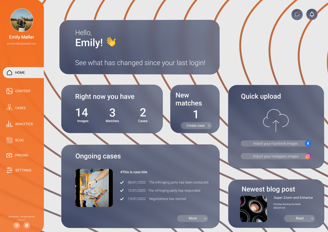
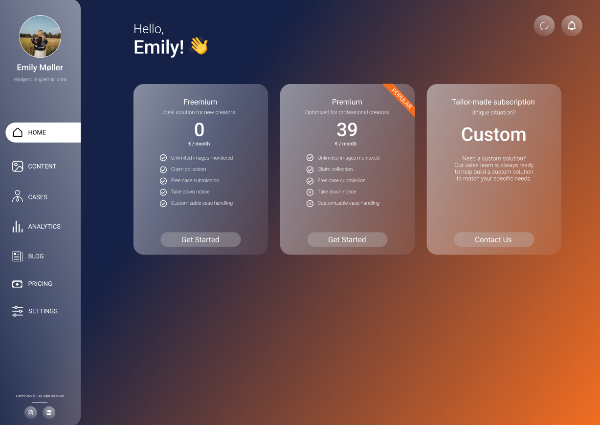
The final concept uses a simple background so the content and actions stay in focus.
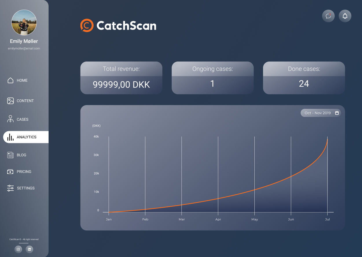
We used five-second and think-aloud tests to check whether the calls to action were visible and whether users could move through the product without confusion.
We implemented the project with HTML, CSS, JavaScript, and Tailwind CSS.
Because the service depends on personal content and case tracking, sign-up and login were essential parts of the experience.
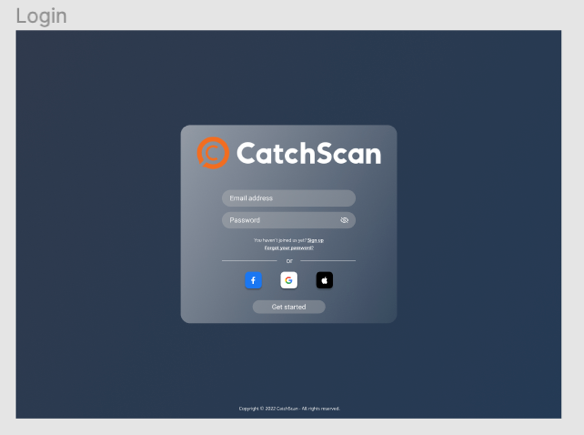
The sign-up sequence asks for essential information first, then introduces additional inputs only when they are needed.

The final dashboard gives creators a structured way to upload work, review matches, understand analytics, and decide what to do next.
The project combined research, information architecture, interface design, and frontend implementation into a clearer copyright-monitoring experience.
Portfolio-aware research, risk, and goal intelligence
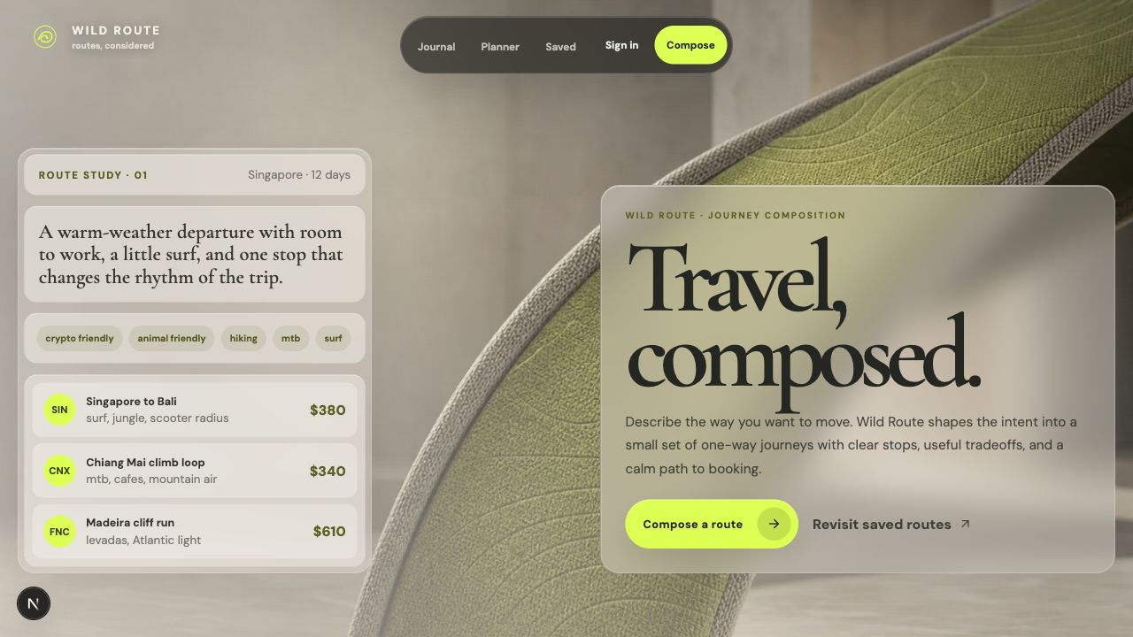
Prompt-first route planning for adventure travelers
Hybrid office management in Microsoft Teams
Student agency and information platform